Remixing street signs

Posted on

Remix:

“To combine or edit existing materials
to produce something new.”

For the past 4 weeks we’ve been working with Remix and Culture jamming in order to create something new out of something existing.

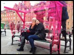
My group chose to remix street signs and conduct a small social experiment, you can see the result below.

Our idea was to explore and challenge the authority of characters and symbols in public spaces. Our goal was to make people stop and think critically about the various impressions we are bombarded with, and not just blindly accept authoritarian looking messages as the truth.

Charline og flyvende afføring - edit + kant

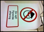
The sign says “Beware! Flying feces”

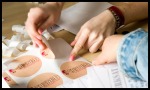
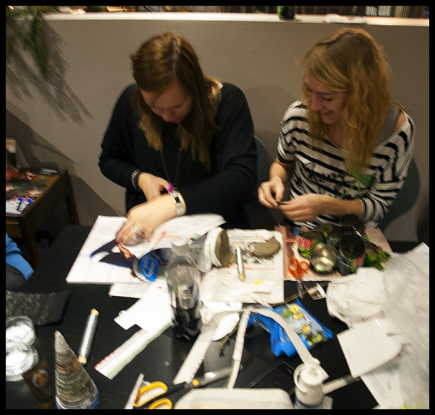
The best remixes are often the simplest, so we chose to alter an existing street sign with our own print and message, and put them up in various weird places in public, to see peoples reactions.

Skilte transformation - kant
The reactions were very different, some laughed, some looked around cautiously, and a lot passed by, not noticing it what so ever. Also, when we set out to put up the signs life happened, and we had to scrap the ‘No asians allowed sign’ as it came off very racist and blurred our overall message.

Liza med kineser skillt - edit + kant

The signs we created were very realistic. Would you obey this sign?

This is definitely not the last time I’m using street signs in my work.

Painting with moss

Posted on

As part of a business plan project my friends Mark and Kasper and I had the pleasure of playing around with moss paint.

Moss paint – the recipe

  • Moss
  • Water
  • Sugar
  • Potato flour

Basically, you blend that stuff like there was no tomorrow = Moss paint.
You paint it on a wall and moist weekly and moss grows out in that pattern, I’m not kidding!

Image

Our idea was to commercialize this ‘moss graffiti’, and market it off as a sustainable and cool addition to the existing urban streetart movement.

Since it’s meant to be used as green graffiti, we used guerilla marketing to promote the product, and we made Kate Moss out of moss.

Image

Some would say this is the ultimate mossification.

It’s done with permission next to the cultural center of Valby, apparently, it’s made quite an impression on people, we get tons of comments on it from people passing by when we water her.

Promoting E-design

Posted on

E-design is a creative education packed with innovation, design thinking and problem solving, but is not that well known – yet.

To spread awareness of our education to future workplaces and partners, we spent the past 4 weeks planning and executing a concept to promote the education.

402

We had the creative freedom to come up with the whole concept ourselves, including target group(s), branding strategies, visual identity and so forth. We split up into 5 expert areas; I was one of the people responsible for coordinating the whole thing, pulling the strings and bringing the different groups together.

After a lot of talking and various ideas we ended up producing a film, to visualize the different aspects of the education, along with the different skills that you possess  as an E-designer. I was the main contact for the film making crew, tying the knots together and making sure all dialogue and deadlines went smoothly.

Different approaches were discussed, and we finally went with this storyboard that was the main inspiration for the whole video.buigui

This was the initial storyboard sketch of the different scenes in the film, pretty close to the end result too,

The last 2 weeks were really intense, the stage set group had very little time to make the props necessary, yet they still managed to pull it all together in time. The film crew worked day and night, literally speaking, to make it to the deadline.
After 4 exhausting and exciting weeks we can now reap the fruits of our labor. Enjoy.

3000 meters of pink cord – 100 companys – 70 E-design students – 4 weeks – 2 cameras – 1 wish

The film is put on a USB device and mailed out to the different companys, in these badass envelopes with our graphic design all over it, looks pretty sweet.

Photos courtesy of Rasmus Arentsen and Tina Bonne Kristiansen

The ‘moving-out-of-home’ rescue kit

Posted on

Task:

Design a rescue kit that solves a certain problem for a specific target group.

Solution:

Introducing the IKEA ‘moving-out-of-home’ rescue kit for younger people moving out of their parents house.

Box

Getting started: The idea

For this project, which was also my exam project, my group decided on creating a physical product if possible, to really get down and dirty with the design elements. We also wanted to solve a problem we had experienced ourselves and could relate to.

So what problem do all young people eventually face?

Eventually, they all move out of home. And this can be quite frustrating and confusing. To make this process as smooth and easy as possible, we designed a kit that explains the different phases of packing and moving step-by-step, and contains all the information you’ll need to get going.

The rescue kit

Being innovative with Christmas decorations

Posted on

3 weeks.

Create an innovative product or concept. 

Make $$$ from it.

THERE ARE NO RULES!

^ That’s what they told us at school. And off we went, running around like headless chickens, trying to come up with the most BRILLIANT,  new  idea, we could make a profit from. Coming up with the new ‘it’ thing is obviously not that easy.

After a week, and a brainstorm including such things as; banana t-shirts, ‘stuff’ involving jellyfish and a hot air balloon; my group and I ended up with the idea to make an alternative Christmas decorations workshop for charity.

jul1

My trusty co-leader Pernille, preparing for the workshop

.

The workshop

The initial idea was to make an open workshop, where people could come and make Christmas decorations out of unconventional materials, and recycled materials, and have a good time. Along the way, it ended up turning into a workshop where you donate your time and finished decorations to the workshop; afterwards, the decorations can be bought, and the buyer decides how much it’s worth.

In the spirit of christmas and those who can’t afford to celebrate it, we decided to cooperate with a charity organization called Folkekirkens nødhjælp which had a non-profit Café, where we could organize our workshop. This way, all of the proceedings would go to charity.

jul2

People embraced the odd materials, as seen with the decorations base made out of mountain dew cans 

.

We had a good time, and the people who actually showed up seemed to enjoy themselves as well. Lots of beautiful yet odd decorations were made during the course of the weekend, and we got to try working with materials such as: cork, bottle caps, mountain dew cans and newspaper.

All of our materials were either recycled, collected in the woods, or sponsored by our business partners: Egmont, Politiken and Silvan.

PC057184

Group members: 

Mark

Pernille

Smoke bomb painting

Posted on

Every now and then, school is pretty sweet.

Today was one of those days.

We had an innovation workshop about smoke bomb painting with artist Christian Elovara Dinesen.


The idea is to ignite these pigment packed smoke bombs and then swirl them around on some paper like there was no tomorrow.

This technique has a certain apocalyptic feel to it, if you ask me.

I seriously need to get my hands on some of these.


All photos courtesy of Rasmus Arentsen.

Window farms for Aarstiderne

Posted on

Homegrown organic greens? Cool DIY project? Self-sufficiency? Sounds good, right?

It is. And it’s all part of our latest school project.

My group and I just finished our first, real business case in which we created a campaign for Aarstiderne, to raise awareness of their company and communicated their brand, history and values.

During our brainstorm and research, we randomly stumbled upon a concept called window farming, got super excited about it, and decided to build our campaign on this idea.

A window farm is essentially a vertical, indoor, hydroponic growing system which allows you to grow herbs and smaller veggies in your own window.

Since this fits perfectly with the values of Aarstiderne we decided to introduce this into their product range

The window farm itself turned out pretty epic, with the possibility of being fully functional if you add a pump and water tank.


Marketing: 

To brand this concept, we created a folder containing seeds which can be planted at home, as a teaser to the idea of growing things at home, and a description and link to the window farm. We put them in crates with fruit and veggies that their customers received, to raise awareness towards this new concept, and placed them at Aarstiderne’s workshops.

Designing the products

Mark did all the graphic work for those sweet folders, while Kasper and I constructed the window farm from scratch.

It was alot of hard work getting everything right; here we are painting the lower parts of the containers, to protect the plants roots from sunlight. 

We had so much fun with this project, and wer’e all quite happy and proud of our work

That’s why it’s such a shame we missed the point of the assignment.

We got a bit too excited about the windowfarm itself, instead of focusing on the campaign.

Our idea had alot of potential and could have been spot on brilliant if executed right.
We missed the mark this time, but put alot of effort and love into this project.
Lesson learned, and I’m already looking forward to more of these projects!

ID card

Posted on

At my school it’s important to be as tech-savvy as possible, since alot of the education revolves around the use of various online tools and complicated programmes.

As an introduction to a few of these programmes, we were given an assignment to design a personal ID card using both Adobe Photoshop, Illustrator and Indesign.

The structure and basic layout of the design was fixed, the rest was up to us and our own imagination.

This is my first suggestion; I changed a few things and moved the parts around a bit.

Finally, this is the end result.

I think the 3D glasses give a nice effect, along with the sunray-esque effect in the background, very dynamic; very unserious.

Playing around with bead portraits

Posted on

As a fun, and creative way of doing framed portraits of friends for decorations, I decided to have a go at transforming pictures of them into pixelated bead art with hama beads.

It was quite a challenge; I knew I wanted to use Hama beads, since they have one of the widest ranges of colors to choose from, and are available at most craft stores and crafty e-shops.

Eventually I found a programme to convert the actual picture into fewer colors, which I could then match to the existing color palette of the hama beads. I had to tweak the details by hand to make it look right in real life.

A couple of thousand beads later, I had converted my best friend Espen, into beads:

Since this picture was taken, he’s been glued onto a piece of cardboard for stability, and put inside a nice frame to hang on my wall in my new home once I move in.

Just for reference, this was the unedited, starting image:

Turned out pretty nifty if I may say so myself.

the green buddha company

We are aware and we care....

WordPress.com News

The latest news on WordPress.com and the WordPress community.